Those who follow us on Twitter or Instagram, or indeed those who know us personally, will know we have a love of maths and statistics. The individuals who share this love of numbers with us will appreciate the beauty behind these figures, but we understand not everyone will share this point of view; it’s an acquired taste.
So not only will we continue to analyse data and share the results with you, but we thought it would be nice to create some art based on our egg data. The objective of this art isn’t to give you the ability to draw conclusions from the data, although this will inevitably happen as we will see shortly, instead they should be standalone images (perhaps videos in the future) which can be appreciated as they are.
Our first effort, well our first effort that we’re happy enough to share with a wider audience, was inspired by some images produced by the Large Hadron Collider. Yes, you are reading a blog post linking the LHC and eggs! The images we found bore a passing resemblance to an eye so we thought we’d try and replicate it while at the same time really try to develop that imagery.
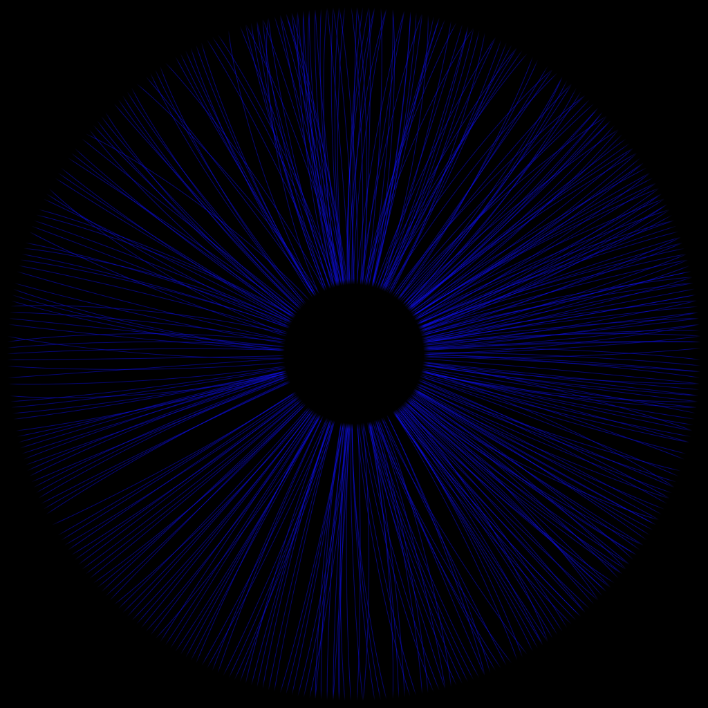
Here is the final result:
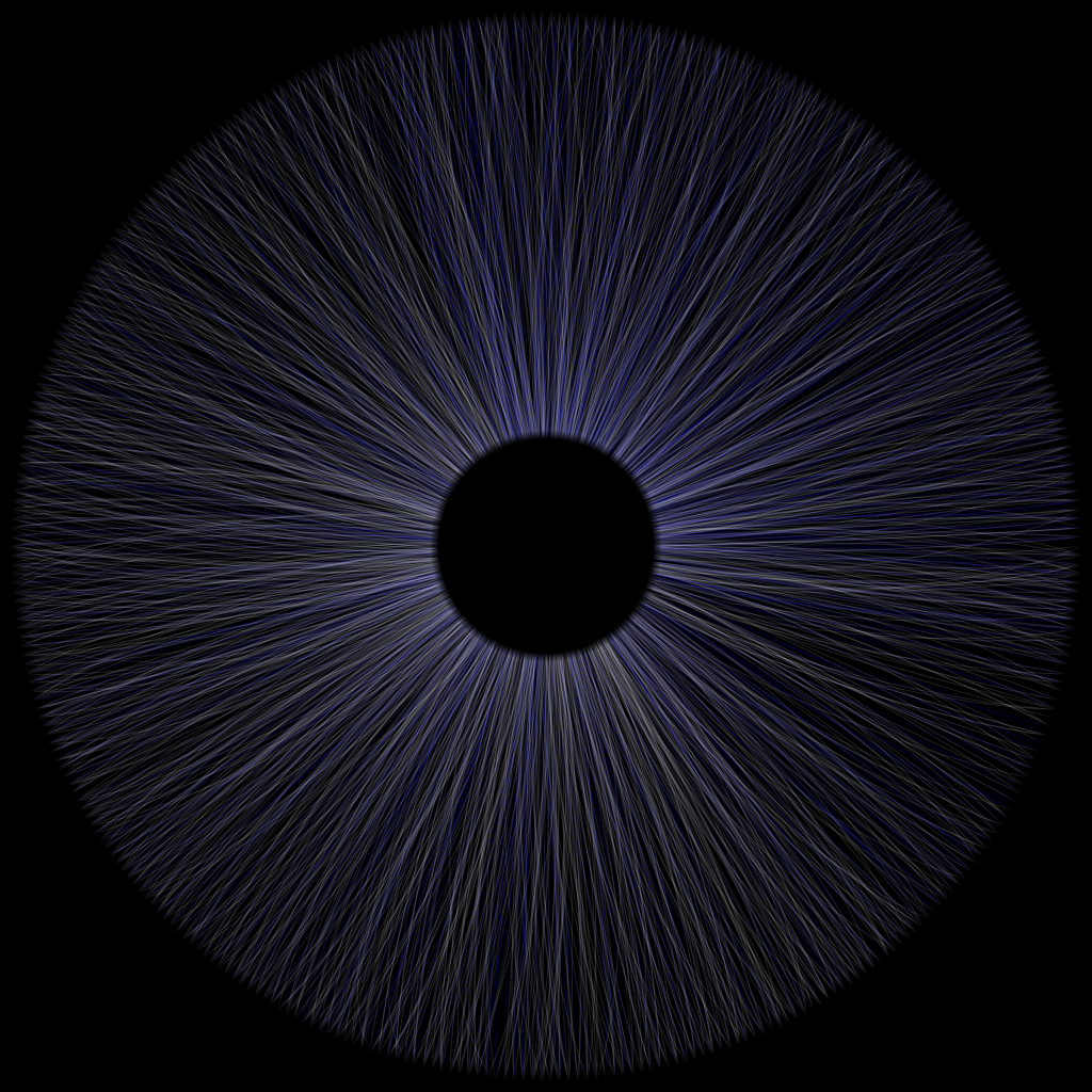
The image was generated according to the following rules:
- Each line represents a single egg that’s been laid by one of the chickens (2356 eggs at the time of writing) and starts in the centre of the image
- Each line ends at a point on the outer circle. This point is defined by the day number in the year it was laid. For example, January 5th is the 5th day of the year, July 27th is the 208th day of the year and so on. There are 366 evenly spaced points around the circle, each representing a day of the year
- The colour of each line reflects the chicken that laid it – by using a hashing algorithm
- The curvature of each line is proportional to the mass of the egg. The greater the mass of the egg, the more curved it becomes
- The direction of the curve is based upon on the parity of the egg number. That is to say, if the egg number is even, the line curves clockwise and if it’s odd, the line curves anti-clockwise
And that’s it. We then overlaid the centre circle to give a more eye-like appearance.
We mentioned earlier that the objective of this art wasn’t to be able to derive conclusions from it, and this is clearly the case when looking at the image based on all eggs. However, you can observe some interesting patterns if we generate the images based on individual chickens’ eggs.
If we look at Ella’s image, we can see lines on only about half the circle. This shows she tends to lay for only 6 months a year barring 5 eggs represented by the lines at the top, a fact that is backed up if we look at her egg laying calendar.
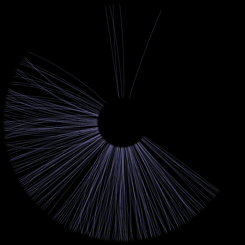
If we look at the image produced from the data on Miss Moneyhenny’s eggs we can see quite a few highly curved lines, evidence of the unusually high number of large, double-yolk eggs she laid. We can also see she’s only been laying for about 3 months.
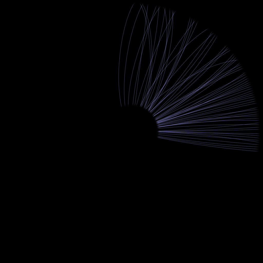
Finally, we can look at a chart for Chilli which shows a good example of a chicken who has laid on most days of the year.
The images were generated using the p5 Javascript framework.
We hope you enjoy these images, please let us know what you think of them. If there’s interest we’d be happy to share some of the code and the methodology used to generate the images.
